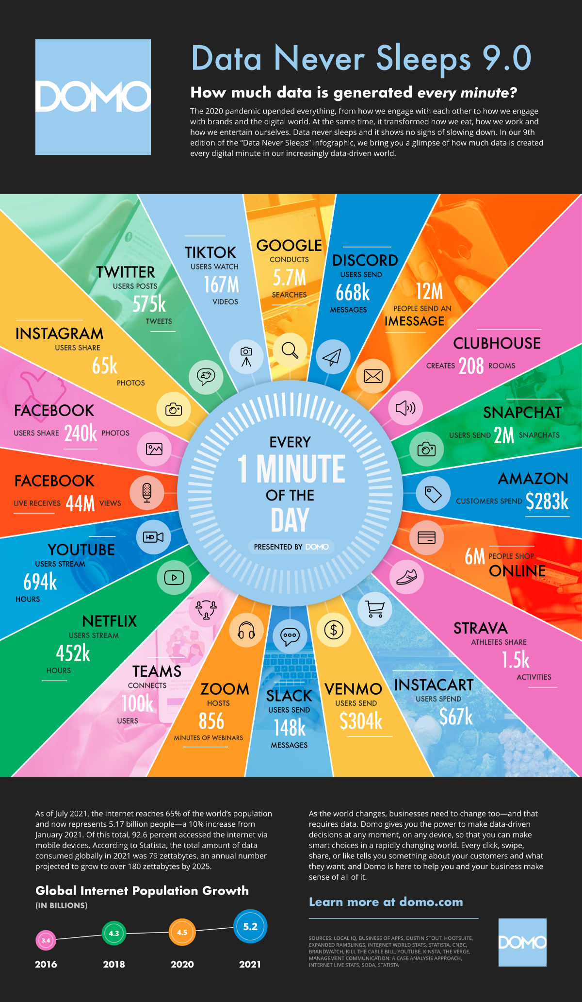
Data is new currency. According to Statista, the total amount of data consumed globally in 2021 was 79 zettabytes, an annual number projected to grow to over 180 zettabytes by 2025.
FYI, there are 21 zeros in a zettabyte. [Source: DOMO]
As a result, most organisations use Business Intelligence tools to visualise data. Power BI is one of the best visualisation tools to get the data from various sources and find valuable patterns.
Power BI has many charts and visuals to present data effectively. Some are Defaults which you can find in the Visualisations pane, and you can add more by clicking on three dots which are called AppSource visuals. These visuals are created by Microsoft and Microsoft partners and are tested and validated by the AppSource validation team. You can also develop your own Custom visuals in Power BI.
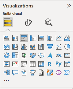
It is important that you choose an effective visualisation to ensure that you display the data in the best way possible. Below are some of the different types of visualisations that are available within the Power BI Desktop.
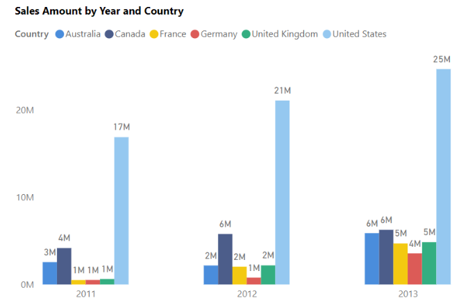
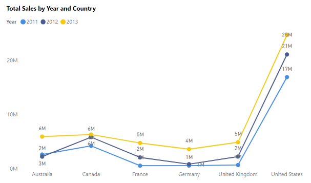
Stacked and Clustered Bar and Column Chart: Bar chart/column charts are one of the most used visualisations. Bar chat is the best option if you have to illustrate comparisons of the data by categories, subcategories and time-based analysis. The stacked format will stack the information items on top of each other. In Power BI, it’s effortless to add Min, Max, Median or Percentile lines. I will cover the formatting options in my future blog.


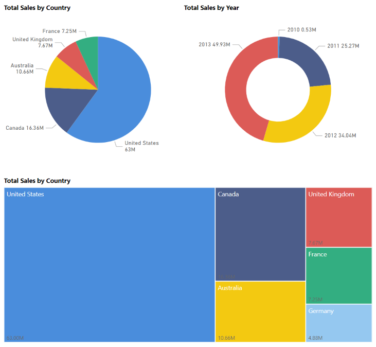
Pie chart, Donut Chart and Treemaps: Pie chart, Donut chart, and Treemap visualisations show you the relationship of parts to the whole by dividing the data into segments. From a data analysis perspective, these charts are not useful because interpreting the data that they present can be difficult. E.g. 20% and 25% segments might look the same and confuse the audience.
However, these charts are often used for aesthetic reasons due to the colourful segments that they display. These charts are best suited for illustrating percentages, such as the top five sales by product or country, or any other available categories.
The pie chart is a solid circle, whereas the Donut chart has a centre that is blank and allows space for a label or icon.
Pie charts and Donut charts present data by dividing it into slices, while the Treemap visualisation displays data as a set of nested rectangles. Each level of the hierarchy is represented by a coloured rectangle containing smaller rectangles. The space inside each rectangle is allocated based on the value that is being measured. The rectangles are arranged in size from top left (largest) to bottom right (smallest).
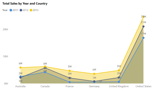
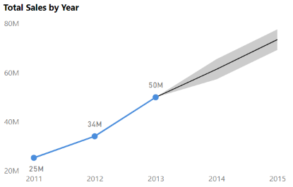
Line/Area Chart: The line chart and area chart visualisations are beneficial in helping you present trends over time. The basic area chart is based on the line chart, with the area between axis and line filled in. The main difference between these two chart types is that the area chart highlights the magnitude of change over time.
Power BI also have a forecasting feature which can be found under Analytics in the Visualisation pane.
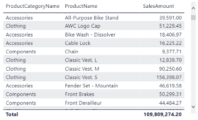
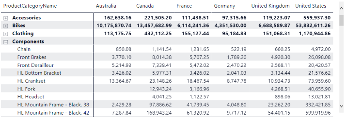
Matrix/Table: The table is a grid that contains related data in a logical series of rows and columns. The table supports two dimensions, and it can also have headers and a row for totals.
The Matrix visualisation looks similar to the table visualisation; however, it allows you to select one or more elements (rows, columns, values) in the matrix to cross-highlight other visuals on the report page.
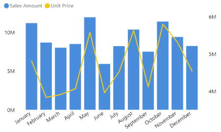
Combo Chart: The combo chart visualisation is a combination of a column chart and a line chart that can have one or two Y axes. A combination of charts allows you to compare multiple measures in a single graph and save space on the report page.
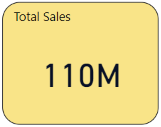
Card Visualisation: The card visualisation displays a single value (data point). It is the best option to show important statistics such as total sales, total customers, margin% or latest order date.
The multi-row card visualisation displays one or more data points, with one data point for each row. One drawback of using the multi-row card is that you can’t remove decimals currently.

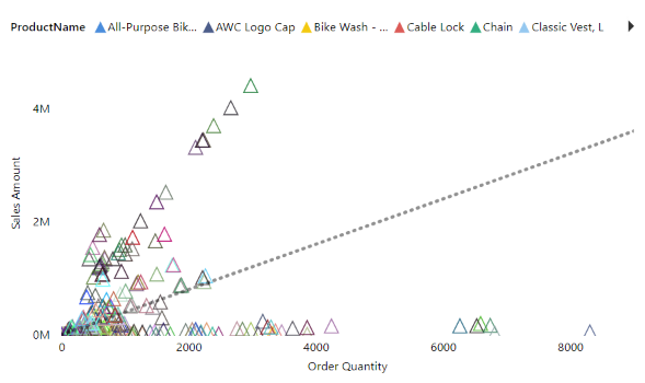
Scatter plot: The scatter chart is used when you will have to show two numerical values, one set on X-axis and another on the Y-axis. It allows you to show outliers/anomalies, relationships between two numerical values, and patterns in large amounts of data using trend/ratio/median line.
In the below chart, you can see some of the products are making more sales. These can help you analyse and understand data more by breaking them by country/region. From that, you can make better business decisions like logistics, costs etc…
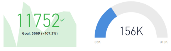
KPI/Gauge: KPI (Key Performance Indicator) and Gauge charts can show the progress that is being made toward a goal or target value.
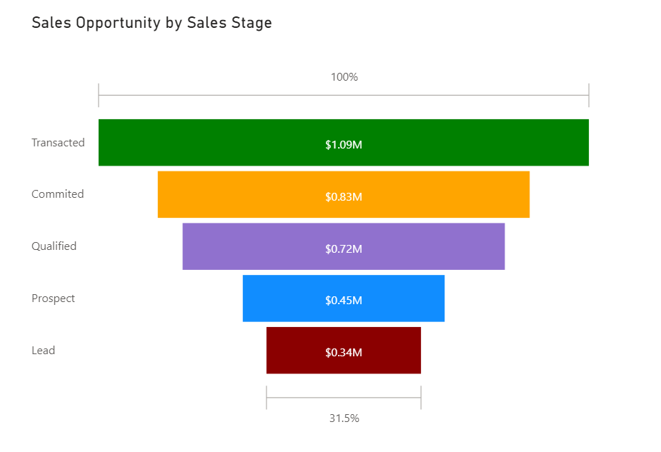
Funnel Chart: The funnel visualisation displays a linear process that has sequential connected stages, where items flow sequentially from one stage to the next.
Funnel charts are most often seen in business or sales contexts. For example, they are useful for representing a workflow, such as moving from a sales lead to a prospect, through to a proposal and sale.
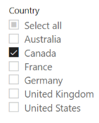
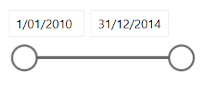
Slicers: A slicer is a standalone chart that can be used to filter the other visuals on the page. Slicers come in many different formats (category, range, date, etc.) and can be formatted to allow the selection of only one, many, or all of the available values.
I hope you learned something new today. My next blog will be on the hidden slicer panel.
Haere rā
Ayesha
