

Introduction
Web accessibility may be a phrase that evokes a number of reactions in different people. As a developer you may feel anything from relief to indifference to contempt. The fact is accessibility is important, easier than you might think, and can still look good.
Web accessibility is not only important for people who are impaired or disabled, it is important for anyone not on the perfect device in the perfect location with perfect conditions when they interact with the web. Whether you have a broken arm, poor vision, slow connection, or are simply on a mobile device, web accessibility, be it good or bad, effects you.
The good news is, designing with accessibility in mind is pretty simple. Following the Pareto principle, if you utilise 20% of web accessibility techniques, you can reap 80% of the benefits. You don’t need to travel to the ends of the earth and research every technique and utilise every resource to make a difference. Simply thinking about how your website will be accessed while you develop it will make a world of difference. The best rule to follow as you go is keep it simple! It’s all too easy to get lost in the moment, thinking you’re being clever, only to make a design that no-one but you understands. Websites are like jokes after all. If you have to explain them, they’re not very good.
Thankfully an accessible site doesn’t have to be an ugly site, movements in web design have allowed for accessible sites to also look beautiful by fitting better with current trends. Minimalist designs lend themselves to being more legible and easier to follow. If you use a function first approach, you’ll likely find form following closely behind.
Accessibility tips
Colour
When you think of users with impairments, you likely think of people with colourblindness. For more detailed information on colour and colourblindness, you can check out my blog on the topic here. At a higher level, you mainly need to be careful with contrast. This not only benefits all users with colour impairment, but it also helps when you have glare on your screen, or if your phone has <5% battery and the screen is dimmed. If you are using colour for hierarchy, make sure to run everything through a colour proofing tool. Coblis, Toptal, and Adobe are a couple of the options available.
Layout/Scale
Don’t make things unnecessarily small. It’s hard enough to hit the right buttons as it is, especially on a touch screen or small device. Don’t make things worse by making dainty little buttons that look great, but are harder to hit than a clay-bird. Big buttons can look great while being super functional. Even if you don’t like the look, I’d take a highly navigable website that is dog-ugly over a beautiful site with trash nav any day.
Responsive Design
Make sure your designs are accessible on all devices. Mobile first design is a good start. Bootstrap gets joked about in some circles as it is so widely used, and some people even see it as the sign of a rookie, but the fact is it works. If you don’t want to have to worry about doing the nitty-gritty work involved with making a website responsive, use a library. You don’t even need to utilize the entire library. Again, 20% of the library will give you 80% of the benefits.
Text
Text is one of the most important aspects to get right. The key points to keep in mind are scale, font-face, and layout.
Scale and Hierarchy
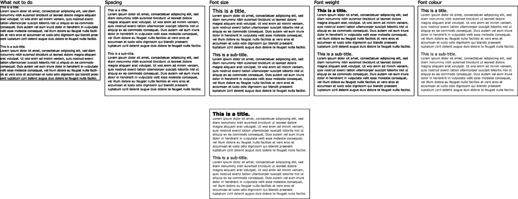
Beyond rendering all your text at a readable and legible size, font scale is most useful for denoting hierarchy. Good hierarchy is important for both visually capable and visually impaired readers. It is a visual cue when scanning text as well as a navigational/audible cue for users with screen readers. As a general rule, H1 will be sparsely used for key information such as page title, H2 will be used for headings, h3 and lower for subheadings, and p will be used for paragraphs and body text. Your p font should be no smaller than 12px, with heading fonts increasing from there. While size is the logical choice for adding hierarchy, there are other options. Font weight can be a clean alternative to increasing text size. The downside to this is there are usually only 2 options, 3+ if you’re lucky; bold and regular. Another option which requires a little more care, is font colour where darker fonts take precedent over lighter fonts, just be careful with contrast. For a beginner, I would recommend only using 1 or 2 of these options, as using all three could get messy very quickly.
Font-Face
All text needs a font-face, and choosing the right font can be a daunting task. Something important to keep in mind is use case. The majority of fonts have been designed for print or display, and sometimes a mixture of both. Times Roman and Verdana are two examples. Times Roman is a fantastic font for print media, but it is not so good for digital media. Verdana was designed for digital display, this makes it a great choice for screen only applications. Another cross-roads you will encounter when choosing a font-face is serif vs sans. There are arguments for both side but in my opinion, the simplicity of sans serif makes it more suitable for large bodies of text as it more closely matches handwriting. I don’t think I’ve ever met someone who writes in serif. This is not to say you should avoid serif fonts. More detail in the font means more variety between letters which is useful above a certain size making serif fonts great for headings and titles. However, anything too small and the extra detail begins to diminish the legibility of the font.
Layout
Where you place your font is just as important as what font you are placing. Think of it like tiling a floor, you don’t buy nice tiles to just throw them down willy nilly. Two key points to focus on are spacing between letters, and spacing around bodies of text. Spacing around letters is simple. While there are things like kerning and tracking, most fonts get this pretty right from the get-go, so all you need to focus on is line height. As a general rule, 1.5 is the preferred option for people with visual/reading impairments. The next step from letter spacing is spacing around bodies of text. This can be accomplished using padding or margin. For this, there is no hard and fast rule. If I had to make a recommendation, I would suggest at least twice your fonts x-height on all sides with even more for radiused containers.
Behind the scenes
Of all things mentioned so far, this is probably the most important to get right from the start. So far we have focused of CSS/Styling decisions, but that’s only half of the equation. The other half of course, is HTML/Mark-up. If you don’t structure your page correctly, it will not only make it hard to apply consistent styles, but it will also make it a nightmare for screen readers and keyboard navigation. The main tags you should familiarise yourself with are <H1..6>, <p>, <article>, <strong>, <label>, <ul>, <li>, <aside>. Just because you can make a website with nothing but <div>, doesn’t mean you should. While using the correct tags is a great start, you can take it one step further. There is more to tags than their identifiers; class, id, alt, type, name, for, and role should all be used when applicable as they help with screen readers and assist navigation.
Language
Now that we’ve covered how to put your content on a page, we should discuss the content itself. I don’t have any grammar tips that are going to change your life, but I do have a tip for writing web content. Keep it simple. That’s the takeaway from this entire blog, really. If it doesn’t add anything important, don’t write it. In a similar vein, don’t write something in 20 words when you can write it in 10. This includes avoiding complex words. Sometimes it’s appropriate to show off your vocabulary, such as with technical writing, but if accessibility is your goal, keep it simple.
Conclusion
Next time you are working on a website, help keep the world wide web an inclusive place by thinking about people in not so perfect conditions. Sitting in a well lit office with a large, high-resolution screen makes it easy to forget the times you’ve been on a mobile with the sun behind you beaming it’s glare inducing rays onto your screen. Like most things in life, good and bad, it’s about forming habits. You’ll soon find yourself meeting a high standard of accessibility without a second thought, but it won’t happen over night. Help yourself by starting with the basics and keep it simple!
Everything in this blog can be reiterated and expanded upon using the links below. This is by no means a comprehensive guide to web accessibility, but should be enough to get you started.
http://accessibility.psu.edu/wcag2/
https://www.webstyleguide.com/wsg3/8-typography/4-web-typefaces.html
https://www.w3.org/WAI/design-develop/
https://bdanewtechnologies.files.wordpress.com/2011/03/typefaces6.pdf
From hard data to fluid design – Scott.
